PiliPili - Brand Identity & Landing Page Design
A deep dive into the process.
The brief
Create a distinctive brand identity that captures the tropical, fiery soul of PiliPili. A bold, vibrant color palette to stand out. Visualize cultural depth drawn from African and tropical aesthetics to speak to an adventurous, diverse audience. Packaging that looks as good in a consumer's hands as it does on a retail shelf.

Design Solution
PiliPili is a brand built on boldness, rooted in creativity and playfulness, the brief called for a brand identity and landing page design that would bottle the passion and personality behind their handcrafted sauces.
I explored a vibrant, multi-tonal palette inspired by PiliPili's range of flavors, pairing it with whimsical typography that carries just the right amount of heat. Expressive enough to be memorable, refined enough to be trusted.
Drawing from African and tropical motifs, the visual language weaves together color and pattern in a way that feels both energetic and intentional, designed to attract adventurous palates and spark that irresistible urge to reach for the bottle.

I really like this project. You may not believe it but I actually smelt peri peri watching this!
Chama Mumbi

color palette
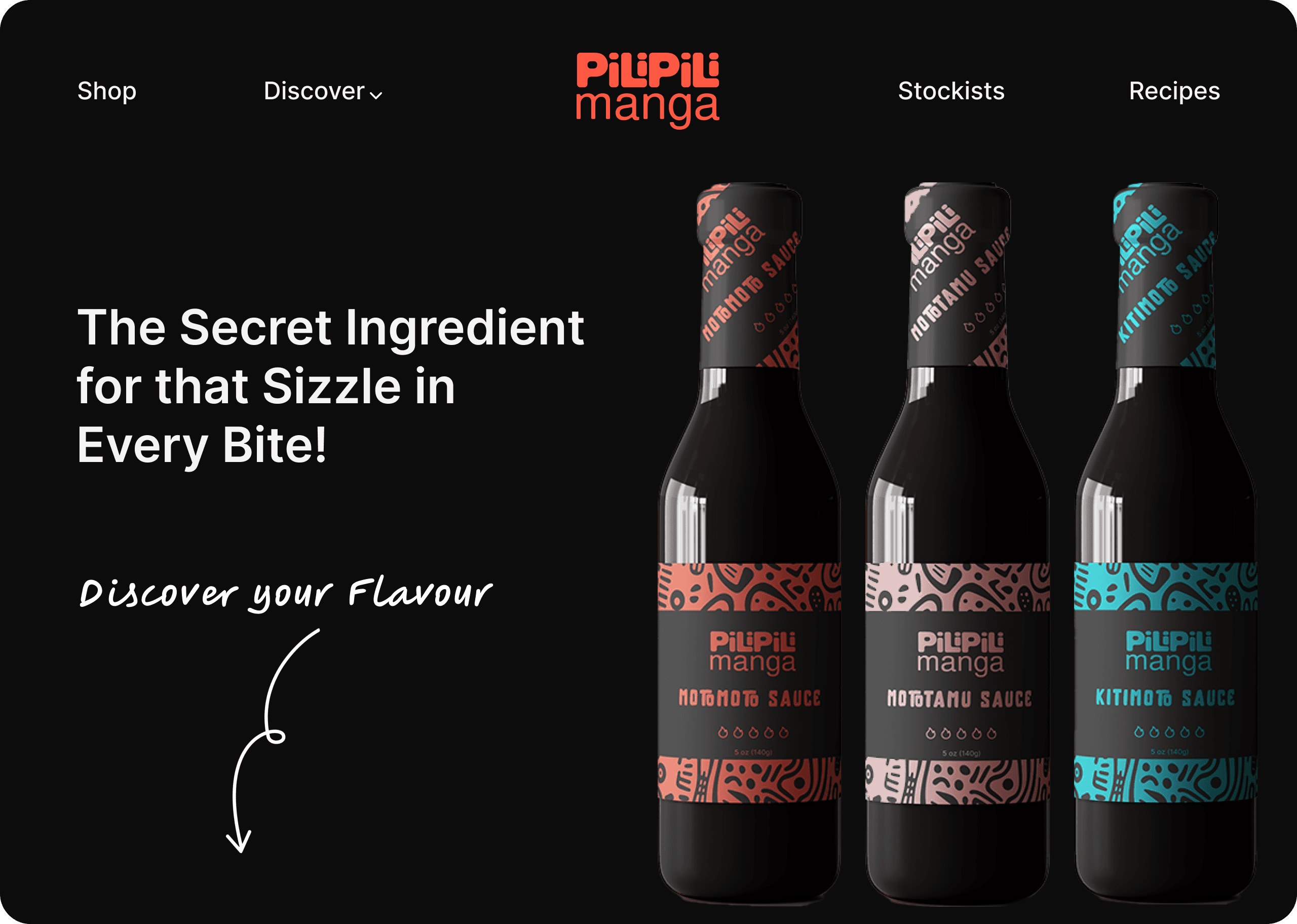
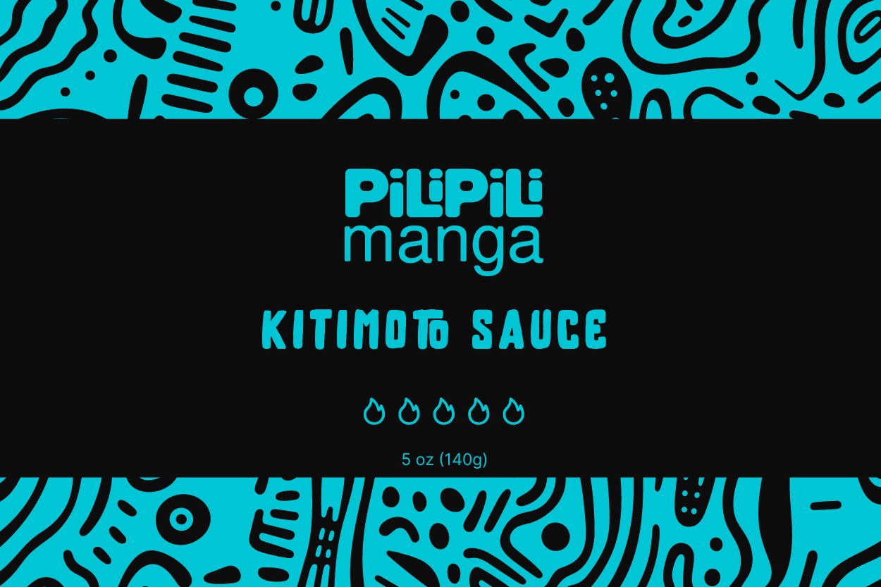
The color scheme was strategically chosen to mirror PiliPili's core ingredients and personality. Bright red channels the heat of chili peppers, while pale pink and bright blue bring a playful, unexpected contrast that sets the brand apart. Together, they communicate the sauce's hot-sweet flavor profile instantly, and ensure the packaging commands attention wherever it lands.

logo & typography
The logo pairs playful typography with soft, rounded edges to give PiliPili's name the personality it deserves. Through an exploration of fonts and styles, I landed on a typeface that strikes the perfect balance between modern and culturally inspired, feeling exotic enough to intrigue and approachable enough to invite.
research & Mood board
The Kenyan hot sauce market is growing, fueled by younger consumers gravitating toward bold, exotic flavors and regionally rooted profiles.
Two brands lead the space: Kaputei, known for its locally inspired spice-and-tang balance and strong cultural identity, and Peptang, a household staple with a broad, practical portfolio spanning sauces, ketchups, and marinades.
With the competitive landscape mapped, I moved into visual research, analyzing tropical-inspired hot sauces and gathering inspiration to define PiliPili's aesthetic direction. The mood board pulled from global cultural patterns and the rich, saturated hues of tropical fruit, setting the tone for a brand that feels both culturally grounded and irresistibly vibrant.
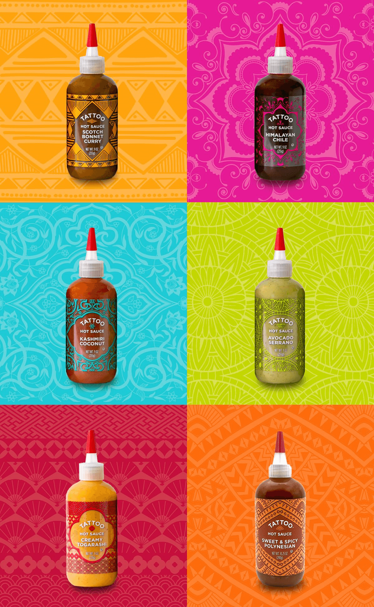
Illustration & Packaging
Illustrations drawn from tropical flora and African rhythms bring PiliPili's world to life, adding a layer of visual texture that feels artisanal, warm, and culturally rooted.
The packaging is designed to be as bold as the sauce inside. A vibrant wrap-around label combines expressive typography with vivid illustrations, while a matte finish elevates the overall feel to premium.
landing page design
The PiliPili Manga landing page brings the brand experience online without losing any of its heat. Bold design, cultural storytelling, and interactive features work together to create a scroll-worthy journey that resonates with the target audience. Informative content sits alongside dynamic visuals, while a clear purchase path keeps conversion front and center.